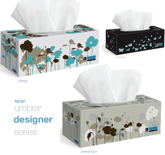
This is a first! I never imagined that a box of facial tissues would fit into the scope on my blog until I saw the print design on those boxes. It is another proof that great packaging can win customers.
It is about time that facial tissue maker acknowledged that a large number of people lives in modern home. I gave up long time ago on finding acceptable prints on facial tissue boxes. But it bothers me every time my eyes meet a box in my home.
Even though the colors do not complement my home decor, I will be looking for the Umbra designer series boxes in stores. I wish they were as cool as the patterns available for the Flip Mino HD. But it is first step in the right direction. Toronto-based designer Annie Chou created these illustrations.
This is a limited edition that Scotties did to appeal to the style-savvy people. I encourage you to get those since if they sell well it may convince Scotties and Kleenex to add good modern prints on a continuous basis.

CindyLou
September 2, 2009 at 14:21It was about time!! Can’t help but wonder what Scotties were waiting for… We heart boxes that fits our decor! Let’s hope Kleenex and others will pimp their boxes too! 😀
NYDesign
September 2, 2009 at 19:58Scotties Introduces Umbra Designer Series | At Home with Kim Vallee http://bit.ly/1VmbhF
This comment was originally posted on Twitter
ascliment4
September 16, 2009 at 12:12Scotties Introduces Umbra Designer Series http://bit.ly/1w5CXV via @AddToAny
This comment was originally posted on Twitter
sPaton
October 29, 2009 at 17:36Where to buy in Toronto???
tooraj
January 8, 2012 at 04:24hi
my name is tooraj
my job is designer in package & brand manager & university profissor in iran
yuo have a good idia
tancks