My blog is about harmonizing décor and beautiful things. This post does not fit the bill.
The idea of transforming a train into a showroom is cool. Sadly, IKEA did not convince me with the décor they put on. Maybe, it is a cultural thing.
Showroom On Rails
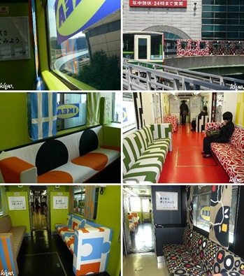
For the opening of its new store at Port Island, IKEA did a huge promotion. The Kobe Portliner Monorail was decorated with fabrics of the new IKEA collection. Each wagon featured a set of bright seating. They even add a small drape panel on every window.
Frankly, it does not really look good. IKEA fails in trying to show too much. There are too many clashing patterns in my opinion. The showroom would have been more effective if they limit to one color family. And show several ways to incorporate it into your life.
Remaking the train interior is quite an achievement. It is also a test for the quality of their fabric. Japanese trains are extremely busy. I have not read a story on who these temporary showrooms wear off. I am curious to know.
Still Running
Bold patterns were painted on the outside of the monorail. You can ride the IKEA showroom Monorail until May 6, 2008 if you happen to travel to Japan.
Q. What do you think about the IKEA showroom on rails?
>>> Sourcing:
Via: IKEA decks out Kobe train on [pinktentacle]
Photo credits: Kiyo


Jennifer
April 25, 2008 at 19:02Commercial design typically takes a different approach than design for the home. I like the clashing patterns because they’re all really bold. You wouldn’t do this in your living room. But as I said, life is different on a train.
This would look really bad, however, if they mixed one graphic, bold pattern with a tiny floral. So, overall it carries the same, vibrant message.
Now, as for how long it will wear… Hmmmm.
At Home with Kim Vallee
April 26, 2008 at 02:55Jennifer: Your point about commercial design versus a home environment is an important distinction to make. But it does not change the fact that I am not fond of these patterns.
olivier lalin
April 26, 2008 at 16:43Please come to Paris Next Mr Ikea! Subway needs a sharp re-looking and those design look so good
Valerie
June 26, 2008 at 21:33Well, the Japanese do love to mix and match flashing bright colors and patterns… so, maybe it’s not really bad local marketing from Ikea’s part?
At Home with Kim Vallee
June 27, 2008 at 02:22Valerie: You got a good point.