I am not generally inclined towards pastel rooms. But by referring to pastels as ice cream colors presented in a modern way, Living Etc caught my attention.
Soft Backdrop
Pastel colors are now on a mission to become the chosen backdrop. The softness of pastels is its biggest advantage over white. Pastels produce a high contrast against dark colors and look great next to light shades.
If you live in a small condo, white is not your only option. Extend a pastel wall color onto the floor for a seamless look. Pastels walls and floor create a subtle backdrop on which you can build on and add characters.
How To Create A Modern Interior With Pastels?
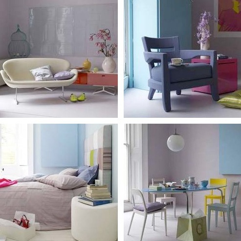
Pastel decors are typically associated with traditional decor. Living Etc tells us in their July 2008 issue how to renew the look. Their recipe relies on adding a dash of neon for modern edge and an unexpected twist. Here are some examples:
Use pastels as a base to boost punchy colors, such as this bright cube and acid cushion.
Paint white furniture of different pastel tones. Then, mix it with a huge bright color piece of furniture.
If you are tired of the clinical white look, paint your bedroom and select bed linens of different pastel tones. Add punch by incorporating a single statement piece.
If you miss the July 2008 issue, you can read the Decorating with Pastels article on Living Etc’s Web site.
CREDITS:
+ Photography by Paul Massey, Styling by Marianne Cotterill for July 2008 Living Etc
Chrissy@TheHome
August 13, 2008 at 15:04We seeing a lot of pastels emerging in the furniture, but they definitely have more saturation than before. Nothing too muted or pale..
Vera
August 18, 2008 at 16:49I love pastels as the wall paint color because they allow you to use white, which would normally be boring, for your accent pieces. If everything already starts out as a color, then white throw pillows, scented candles, and even furniture will look right at home in the grand scheme.
Judith of better home, no garden
August 25, 2008 at 18:23Great insight into the pastel look. That’s an area I haven’t seen anyone covering lately. I actually like the idea of taking a monochromatic approach. Pastel furniture sprinkled (excuse the pun) among saturated versions of the same hue. Pastel pink intermingling with hot pink. Pastel blue nested next to deep turquoise.
RicH
March 1, 2010 at 12:26I love the blue table could be used for more than a kitchen yes.
But personally looking for southwest pastel colors in
possibly more than southwest furniture patterns.Always loved the
optimistic feel of them.