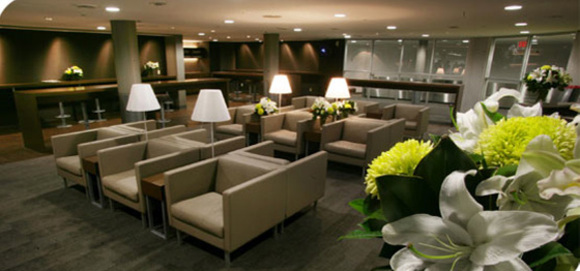
Two words: style and comfort. I like them for their stylishly modern and comfortable lounge at the Billy Bishop Toronto City Airport. Porter put attention to details. Usually, flying one trip with them will convince you.

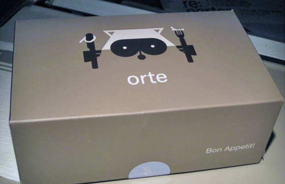
Their brand identity is superb. But for them, it does not stopped with their advertising and their in-flight magazine. The same level of details and attention is integrated in their services.
It is not surprising that Porter looks so hip and different from other airlines when you know that the agency who developed their image is Winkreative, the agency of Tyler Brûlé. He is the Canadian guy who started Wallpaper* magazine.

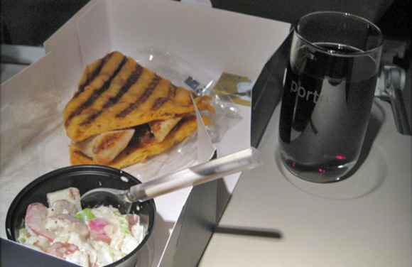
To give you an idea of what I mean, I took a photo at the free dinner box they served yesterday on the flight from Toronto to Montreal. We had one piece of chicken sandwich. This were made with big chunks of grilled breast chicken cooked with green peppers. The salad was an apple and potato salad. Wine and beer are complimentary. We had a Lindt Milk Caramel Chew for dessert. In a time where airlines are inventing for more and more extra charges, I welcome the old-fashioned way passengers were served on an airplane.
If you wish to know more about their mascot, Mr. Porter and how the raccoon image is completely integrated within the brand, read this excellent interview that Grace of design*sponge did with the illustrator Neal Whittington. He is the guy who created the character.
