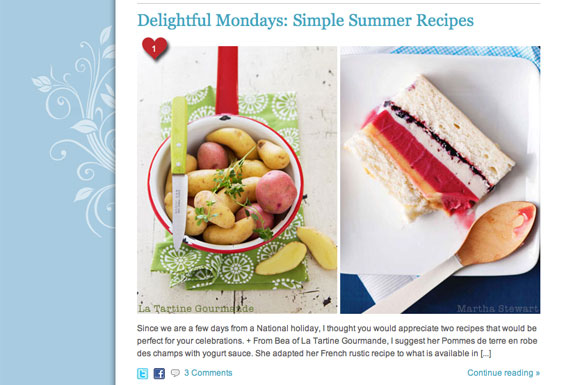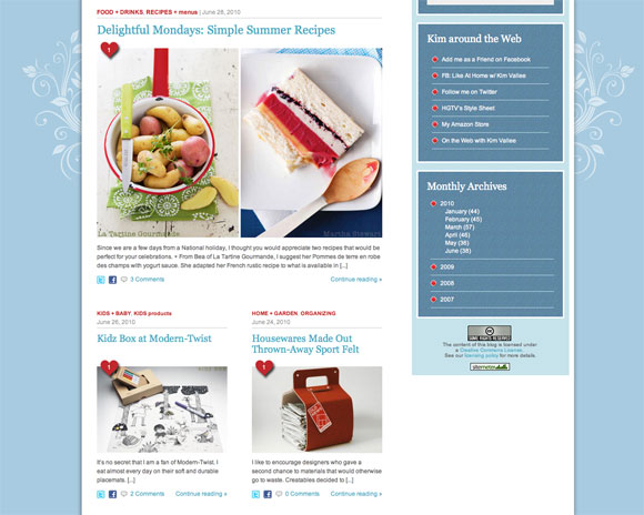
Today was the day that we installed my new Like feature on At Home with Kim Vallee. This is the red heart that you see on the corner of the picture. The heart is positioned at the top and the bottom of every post. You simply click on it to show that you like the post. It records the number of likes and a cute arrow will indicate that you liked it. For the moment it is not linked to the Facebook Like feature but we plan to support that in the future.
We updated the home page, the category pages, the search results page to put emphasis on the pictures and a streamlined look. We also add a Tweet this! button and a Share on Facebook buttons. We repositioned the Nb. of comments since the old design was confusing. And the Continue reading… moved to the right.

This marks the Phase 1 of my Web site redesign. We laid down the building blocks on which we will enhance the At Home with Kim Vallee’s site. I planned lots of great add-ons that will be implemented in phases until this fall. Some of the changes were done in the backend. They might be visible to you but it involved a good amount of development work.
Post Redesign

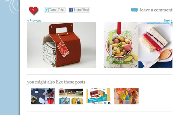
We polished the bottom of a post. You can now navigate to the previous post or the next post directly from a post. The rest were cosmetics changes.
Finally, we removed the frame that characterized my pictures since I started blogging. I decided that with the heart it was time to streamline my look. This was a huge job that since it has impacts on posts. I want to thank my technical team, Chris Bavota and Jerome Paradis for making this a reality.
We are still fine-tuning little glitches here and there before we continue our work on phase 2.

CindyLou
July 1, 2010 at 00:11So cute! I LIKE! ; )