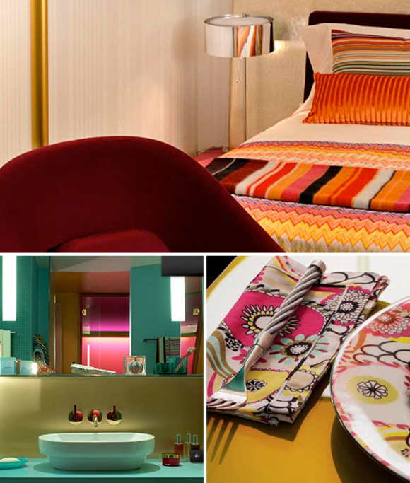
Using bold colors and patterns requires more than an eye for design. One luxury company who is known for their bold use of colors is Missoni. The Italian brand opened their first hotel in Edinburgh, Scotland last June. Four more hotels is scheduled to open over the next few years.
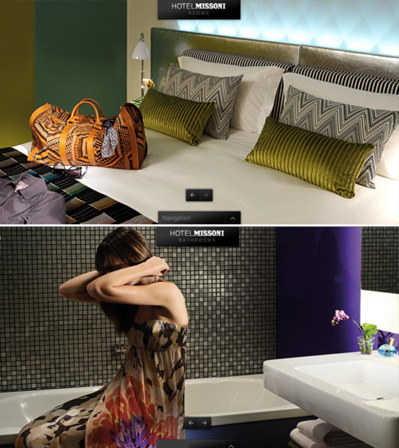
As you would expect, the room decor is inspired by Missoni’s line of fabric. Although I do not like all their room decor, I find that some of are well-done. I wish to share my favorite ones with you. The secret is often to use solid colors taken from the bold pattern palette. You do not wish to add new colors. Then, you can oppose textures and finishes (ex: mat vs shiny).

The richness of the more subtle scheme rooms comes from a major element done in a metallic finish. If you like it, check out the Golden Age Silver collection by Missoni.

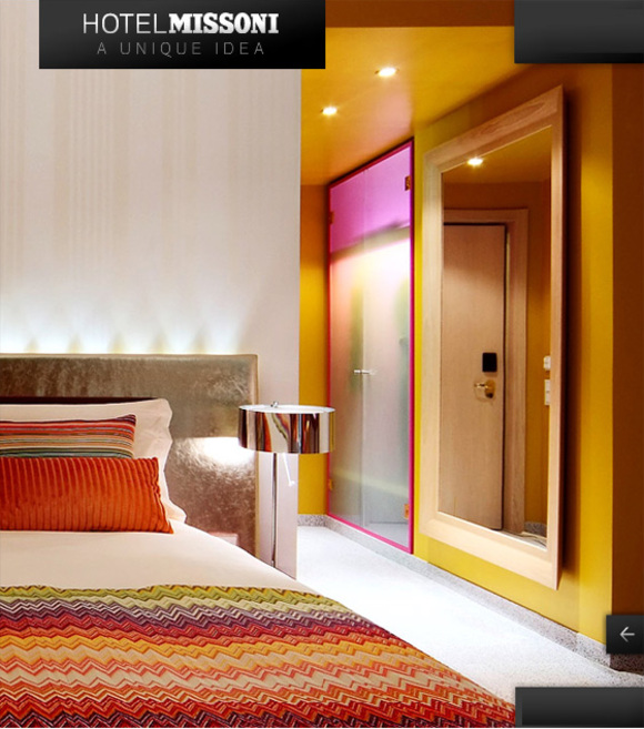
Although the entrance is a bright yellow, the main walls of the room have an almost plain beige wallpaper. This is what you need to not compete with a bedding.


Olga
August 25, 2009 at 13:00This is a very nicely designed hotel. Superb, thanks for posting. I love your blog — it’s definitely an inspiration for my own blog dedicated to funky brands!
cacophonyart
August 26, 2009 at 19:52Wednesday Interiors: Missoni Hotel in Edinburgh, Scotland. Balance busy patterns with bold use of colors and lighting. http://tiny.cc/bKHt1
This comment was originally posted on Twitter