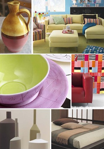
Hooray! Warmer hues and stylish colored home décor are back in fashion. You see, I am not a fan of white or pastel rooms. I prefer living with the warmth of mellow tones.
The color specialists have established that these colors would be hot. Confirming the death of the minimalist style, the baroque style movement continues in 2008. Black and white will work as a backdrop palette and it is always used with a contrasting accent color.
One of my favorite color combinations for this year is shown on the ochre and pink vase. The russet line adds a sense of sophistication. Remember this color palette the next time you plan a tablescape.
Living with colors
Warmer reds, cranberries, burnt oranges and fruit colors would be strong this year. And bright yellows are making a comeback. My top floor is an open space at home. Except for the original long brick wall on one side, the rest of the room is painted sunny yellow with medium brown wood beams, trims and doors. Being in a yellow room triggers my creativity.
If you paint a room bright yellow be warned that you may be shocked at first. But wait until you put back all the furniture and accessories to pass your judgment. My furniture, linens, drapes and accessories are mostly natural tones or muted blues. My floor is covered with textured terracotta tiles and a Prussian blue carpet. If you cannot live with strong colors like reds, yellows and limes, reserve them for your accessories.
Explore the world of textured carpets, wallpapers and wall coverings. There are a lot of choices on the market.
Gray is the new Black
Over the last two years, I have seen fabulous gray rooms done by interior designers. One advantage of gray is that it is more subtle than black. When done it right, it brings the same level of sophistication to a room than black. Expect softer grays this year. Taupe, granite, putty and stone will be the most fashionable tones while silver and champagne add sparkles to any room.
Next to the gray, you will continue to see an array of deep dark shades. This trend started last Fall with the revival of purple and burgundy. On the softer side, you get periwinkle and Pink is still going strong is several shades.
Muted Natural Tones
Look for shades found in the natural landscape. You start with the earth: sand, camel, ochre, rust, mellow browns and pumpkin. You can mix those with denim blue, soft roses and lily pad green. Vegetal and mineral shades are represented by olive green, khaki, emerald, aquamarine and copper.
And the most liked color, blue would be prominent mainly because people like it. From soft icy blue to muted cerulean, you can take your pick.
Sourcing:
Learn more: Home Design Trends for 2008 on AOL – photos from Pantone View inspiration for interiors 2008 guide and from IKEA
Learn more: Be the 1st to Know Popular Decorating Colors for 2008 Experts Announce Color Forecast on PR Leap
RELATED POSTS:
+ Spring 2008 yellows
+ More Color Trends for 2008


Liberty Post Editor
January 3, 2008 at 09:43I adore gray and the natural landscape. Beautiful post. I do like the colour trends for this year very much.
Jenn
January 3, 2008 at 16:01I can’t make up my mind, I love so many different types/colors in spaces! But those images are great. That sofa (sectional) looks so cozy – I want one just like that.
Dorothy Kryworuchko
March 30, 2008 at 06:12Hi Kim, the new colours are great. I have always loved earthy tones.
I am into reclaimed and refurbished furniture. If I paint furniture, what colours would be trendy right now?
Thank you!
Cheers to you
Dorothy