I enjoy reading the Home and Garden section of The New York Times because they showcase amazing homes.
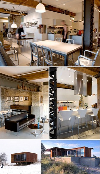
This week, The New York Times featured a couple who moved from a great rent-control apartment located on an upscale New York City’s neighborhood to renovate two basement units that used to be the turbine room of the old Standard Mill in Minneapolis. It is quite a change of pace.
The Needs
The owners are a couple who now runs their business from home. They operate Hopkins-Baumann, an editorial design studio for magazine and book publishers.
The couple wanted to fit a business office, a guest suite, a kitchen, a media room and a professional library on top of the standard home amenities in 2600 square feet.
They hired Geoffrey Warner of Alchemy Architects in St. Paul, the architect behind the weeHouse modular prefab projects. Strangely, Geoffrey Warner never did a condo unit before. It is interesting since doing a renovation is very different than building a new construction.
Creating Tensions Between the Elements of A Room
The kitchen is sleek and modern. The high rectangular stainless steel Valcucine kitchen’s hoods oppose the industrial relics. By creating tensions, you can add lots of visual interests to your home decor. It is not an easy task to recreate that look. So I suggest you leave that design trick to visual art professionals.
Go Over The Top On a Few Details
I like that they kept some references to the turbine room. We can see some part of the four-feet deep foundation wall separating the two original units. Instead of repairing the crevasses, they used the wall imperfections as niches to harbor knickknacks.
The 50-foot floor track stretches from dining room to office to unite the office conference table to the dining room. A cheaper option would have been to use ordinary casters. By opting for the track, they own a conversation piece.
The metal beam is stunning. I enjoy how they nicely display the wooden art pieces on the edge. Do not miss to check out the huge arched window; it is so charming.
MORE READING:
+ Via The New Time Times
+ Photos by Michelle Litvin for The New York Times – rights reserved
+ Bottom photos: Arado weeHouse and Marfa weeHouse

