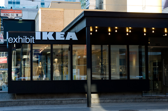
I attended the opening gala of the exhibitIKEA last Wednesday night. It showed IKEA under another eyes. It is inspiring to see how four renowned artists transformed everyday products and furniture. I truly enjoyed three installations out of the four that are presented.
Bruno Billio’s Chair Columns
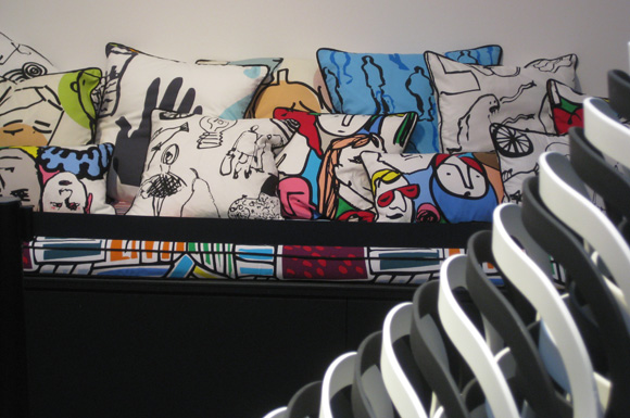
As you enter the gallery space, you will notice the chair columns. Bruno Billio stacked 400 black and white identical IKEA REIDAR chairs under a big mirror to create his piece. Honestly, I only care for that piece because it created zones for the party. The nice fabric of the cushions on the long bench caught more my eye.
David Dixon’s Dressing Room
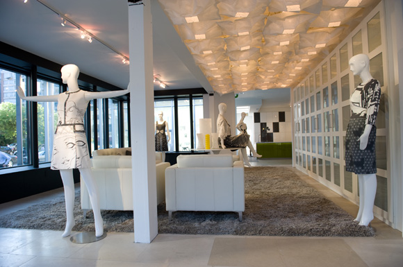
The dresses created by fashion designer David Dixon were my favorite part. It is not surprising that he designs everything around a large dressing room.
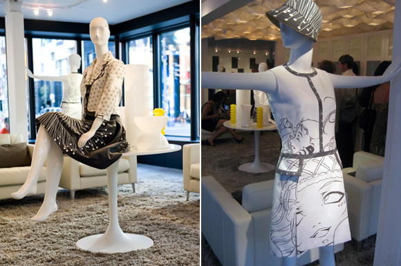
Dixon really demonstrates that, with a proper eye, you can take mass-market fabrics and produce a refined product. Like he does for his own collections, he selected a color palette for his installation. I never thought that they were as many fabulous grey and white fabrics at IKEA.
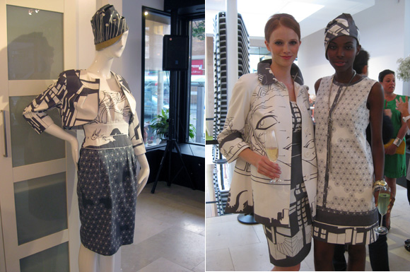
It is also a nice lesson on how to match patterns to create an individual look. I might steal his fabric choices for a chair that I wish to reupholster with several fabrics. Grey and white is the palette of my living room.
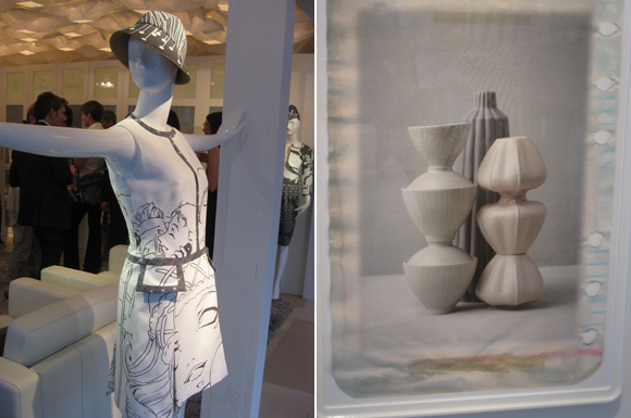
George Whiteside’s Still Life Photos
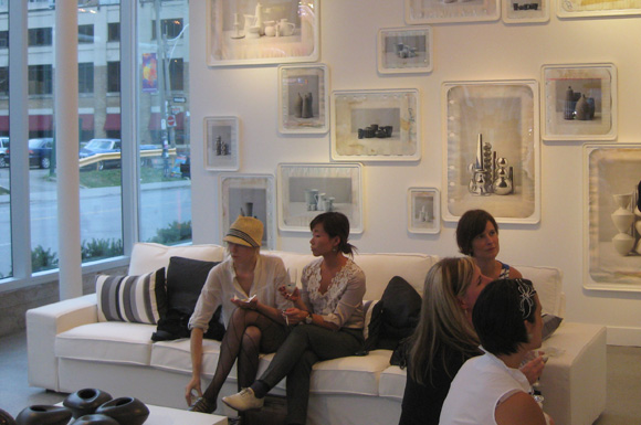
Influenced by the work of Italian painter Giorgio Morandi, he layered vintage papers as his background and created soothing combinations with IKEA vases, pots and objects.
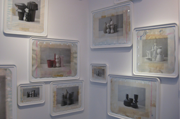
His photographs were all framed in white IKEA ODBY frames.
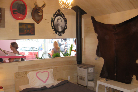
Thrush Holmes Shack
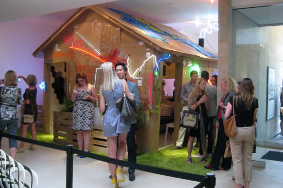
Holmes built the outside with the nondescript IKEA flat boxes. The graffiti style exterior contrasts with the refined interior. He staged a cozy guy bedroom, that does not scream IKEA.
There is still time to see it in person. exhibitIKEA is open to the public today until from 10am to 6pm and on Sunday, August 21 from 12 to 6pm. It is located at 363 King Street West, Toronto.
Disclaimer: I was invited by IKEA, who paid for my flight from Montreal to Toronto and my hotel. Besides showing up at the media event, they asked nothing else from me. I wrote about the exhibit because I think that it is worth a visit.

angela@spinachtiger
August 21, 2011 at 10:41I love Ikea. The gray and white fabrics are so smart and the softened rectangle frames are a nice shape. White accents are a favorite of mine.