I said it before but let me repeat the principles behind successful design. What you need to do is to create several depth levels and to guide the eyes towards your focal points if you wish to achieve a divine mood.
When I was at interior design school, they teach us how to design monochromatic rooms that look amazing. The best ways are to use play with textures and several hues.
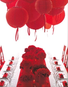
To help you grasp the concept I am showing a red table design taken from Martha Stewart’s Wedding magazine, The Magic of Color edition. Do not get me wrong, that table look fine but by implementing a few small changes we can achieved a more striking look.
The bones of the red table palette are sound. Each element taken separately looks exciting. It is when you put everything together that you discover something is missing for a total Wow factor. You will find that it is often the cases.
The current red palette design missed on a great opportunity to play more with textures and tones. Things look too much similar. The center runner section seems to be a big chunk. With no focal point, you can hardly distinguish the objects even at close range.
To be fair to the Martha Stewart’s Wedding staff, deep crimson and black cherry are hard to capture on photos. Red offers a narrower range of shades to play with if you do not wish to switch over the reddish pink hues. If you are new at designing a monochromatic scheme, start to experiment with greens. I will show you later this week a top-notch example from a wonderful florist I discovered over the week-end.
First, the red tabletop can be improved by interlacing little spots of greenery inside the flower arrangements. A talented florist can easily fix that for you. The votive candle holders could have been a softer red or even a burned orange to act more as a trail delimiter. Matching the ribbons hanged on the lanterns to the votive holder color will intensify this trailing effect.
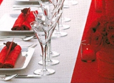
If you are willing to deviate from the monochromatic scheme, sage or olive colored glass votive will add more interests. Putting beside a complimentary color will made the reds pop more.
Since I am looking for more textures, my preference goes for a translucent runner or a taffeta runner with an alternating transparent and opaque line pattern. Opt for textiles that symbolize festivity.
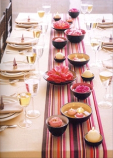
Finally I want to show you a table that proved that there is no need to overcrowd the center of your table. I find that tables are often too crowded with decorations in large scale celebration events.
The pink tabletop published on that same Martha Stewart’s Wedding edition is divine. The runner section is a masterpiece of simplicity. This is a sophisticated look that everyone can easily reproduce at home. Borrow it for your next dinner party. It is suitable for indoor and outdoor parties.
The key design idea behind the pink tabletop is repetitions of distinct yet similar elements. The arrangement is lay in a line to form a classic pattern with modern vibes. What make it works is that we got several sizes of decorative items in a two-step alternating plan. You got trio of floating candles followed by 2 bowls of flowers (roses and peonies) followed by one large candle sphere and so on.
Try out different ways to set up your table just for fun. By practicing ahead of your party, you will be able to determine what you need to complete the look. And you will be ready for an impromptu dinner party. Do not be shy to discuss here how you set up your monochromatic table. I like to hear your viewpoints.
Link: Martha Stewart’s Wedding magazine – all photos from The Magic of Color edition displayed until July 30, 2007