You see more and more bold patterns all over the home decor magazines these days. Bold patterns are tricky creatures that need to be tamed. No fool proof rules can tell you how to do it. It is an art.
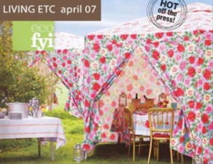
Even the best magazines messed up their arrangement sometimes. The perfect example is this ugly garden party scenery published on the latest edition of my beloved British magazine Living etc. But it gives me to occasion to explain to you why this design fails.
The picture is a great example of what not to do. It is sad because with small adjustment the whole thing could look good. The first mistake was done by the tent maker, Cath Kidston. It is important to create depth when you setting a room, especially when you dealing with an outdoor space. The tent designer should have use a different pattern for the roof than the walls. You could have a band or something that break down the two sections visually. For me, Cath Kidston’s Rose Maroc Gazebo lacks this attention to details. To be fair, rose print is not my style.
Assuming that the strong rose print looks best on the roof, I would prefer a light lined pattern (like the square tabletop) for the walls. The reason I do not recommend strong patterned walls is that it limits what you can do for your tabletop. As a party designer, I want to keep all my options open to create a fabulous table design. Because the walls have a strong pattern, the table is lost on the picture.
Also, if you buy a pattern fabric tent, try to get prints on both sides; otherwise the gazebo does not look at its best when you are celebrating under it.
The second mistake was done by the stylist who should have put the light line-print tablecloth on the table under the tent. Even if the tablecloth is a lighter rose-print version, I do not like the effect when they put so close of each other.
If the idea was to promote the rose-print tablecloth, the rose-print table linen will look better laid down on the buffet table (the square table on the picture). In real life, it will look even better because the buffet table will be further apart from the tents.

If I was planning a garden party event with these rose-print gazebos, I probably use a textured single color tablecloth or a contrasting pattern tablecloth. Like I said before, you must create some depth in your space. Plan to have a thing or two that really pop up.
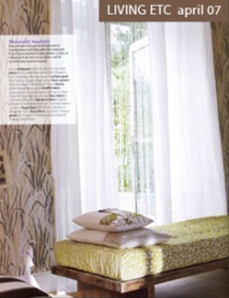
The best way to use bold patterns on different items of a space is to mix and match patterns. So each pattern stands on its own. The end result is a space that has definitions, several weights and depths. This interior, also published on the same edition of Living etc, is a great example of what I am trying to express. The patterns do not look alike but share a nature inspired theme and they are in contrasting enough hues.
When done right, patterns are fun to live with. So try to mix and match patterns from different lines and brands. The worst thing that you can do is to limit yourself to the patterns from a single collection.
I invite you to share your thoughts on mixing and matching bold patterns. Do you like the garden scenery or do you prefer something more subtle like this interior?

