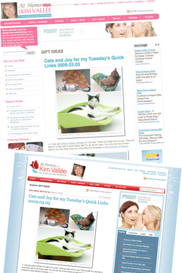
As you can see, the new layout is up and running. It was a lot of work but looking at the before and after shots, I feel it is worth it.

Over the next weeks, I will explain why and how I migrated to WordPress and why I felt I needed a new layout. This series will be published on my second blog, On the Web with Kim Vallee, which will also get this look shortly (in a week or two).
Update Your Blogroll
I published my Daily Fab Reads at the bottom of the page. It shows 7 favorite links. I will alternate them from time to time. I will also update my blogroll to reflect what I am reading right now. It has been a while since I did it. My blogroll catalogs what I read; for me, it is not about link exchanges. As a curator, I want my blogroll to be a representation og my tastes and sources of inspirations.
Please note that I changed the URL of my blog. If I have the honor to be on your blogroll, I would appreciate if you update my link to https://athome.kimvallee.com/
Places is now fully integrated with my blog. It will enable me to take advantage of the best bells and whistles of the Praized platform. Places also migrated to a new URL.

Patrice-Guy Martin
April 4, 2009 at 15:13I like it! Nice colors, clean, efficient, simple. A great job, félicitations!
Oza Meilleur
April 4, 2009 at 19:52CONGRATULATIONS, Kim!!
Though your site was already fabulous,
you’ve now outdone yourself — BRAVO!
It is indeed one of the classiest sites around…
and I’ve made the necessary URL change on the anglo
side of my site so that my readers may continue to
benefit from your great tips & finds.
Wishing you continuous success,
Mudd a.k.a. Happy Oza 🙂
xoxo
M comme Maman
April 4, 2009 at 20:16Wow! Superbe!! J’aime beaucoup le look clean, épuré et frais! Bravo Kim!
Tiz
April 4, 2009 at 20:16Looks great! Nice contemporary look.
Vanessa Sicotte
April 4, 2009 at 20:21Une belle réussite! Kudos!! Wishing you lots of success.
v.
Anouk
April 4, 2009 at 20:43Wow, I love your new logo, and the whole site! Congrats 🙂
CoronadoCookie
April 4, 2009 at 20:45I love the new look Kim ~ very sophisticated and modern. It’s fun to update things sometimes!
Renée
April 4, 2009 at 20:57Bravo Kim, c’est vraiment très beau, ce long travail valait la peine. Toutes mes félicitations. Nous allons avoir encore plus de plaisir à venir te lire!
Vanille
April 4, 2009 at 20:59Kim, I like the new look: Fresh and stylish !
At Home with Kim Vallee
April 4, 2009 at 21:56Thank you very much! You made my day.
It was a team effort. We worked long hours to design, convert and implement everything. I am exhausted but your kind words of support fill me with energy. Now, I can go back to write 2 to 4 posts on weekdays.
Liberty Post Editor
April 4, 2009 at 22:56Gorgeous new look. I love the colour combination.
Fiona Richards
April 5, 2009 at 00:27Great job Kim! Your design looks modern and professional and energetic. It must have been a lot of work to change it – well done!
Fiona
Tanveer Naseer
April 5, 2009 at 00:36Congratulations Kim on the new look. I know Jerome helped as well so give my congrats for a job well done to him as well.
It might have been trying at times, but I think the payoff in the end was well worth it. 🙂
Tanveer.
Jenn @ HWTM
April 5, 2009 at 13:48Looks absolutely fantastic, Kim! Congrats and great job!! 🙂
Anna
April 5, 2009 at 13:49Congrats on the new look Kim! Looks nice and smooth 🙂
It's A Jaime Thing
April 5, 2009 at 22:41Congratulations, Kim, it looks so perfect!!! I love it. Love it, love it, love it. Yay! Have a lovely day…
-Jaime 😉
Jerome Paradis
April 6, 2009 at 18:10Thank you Tanveer!
And I love all the positive comments!
koukla
April 6, 2009 at 18:13WoW! I love it!
Yves Carignan
April 7, 2009 at 14:13Congratulations ! This new version looks great and fresh ! The tulip logo is very nice !
Yves